
BAHS Navigation Signs
As a teacher, it’s very easy to get wrapped up in your own classroom. That is why we get into the job after all. But after a few years of working hard to create more automated systems in my classroom and creating evergreen high-level materials that can be reused from year-to-year, I started looking more closely at the hallways around my school.
One of the things I noticed in the building ever since I started working there has been the sterile nature of the hallways and public spaces. This is because the most current building was opened in 2009 and very little character from any previous buildings has translated over. The large beige walls have rarely had anything other than temporary flyers on them.
So last year I designed some large banners with our school’s mission and vision statements printed on them. I printed some for the rotunda entrance to the school and on two large blank walls in other walls in the building. I also repurposed some light post banners that I originally made to hang in our downtown area to hang in the major hallways at my school.
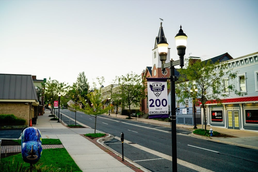
BAHS Banners on Main Street 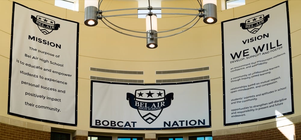
BAHS Rotunda 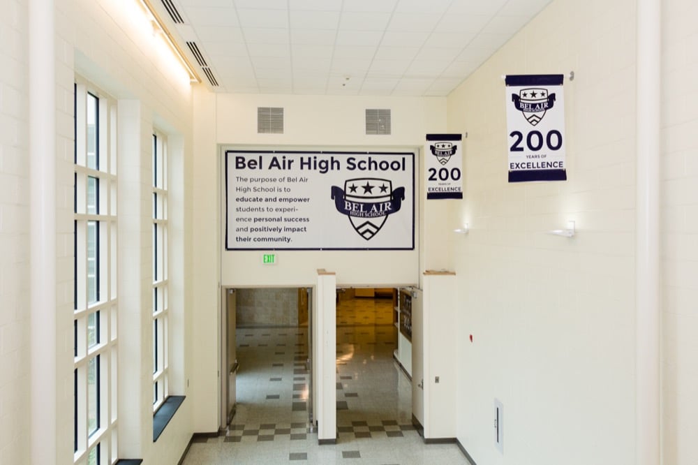
BAHS Hallway 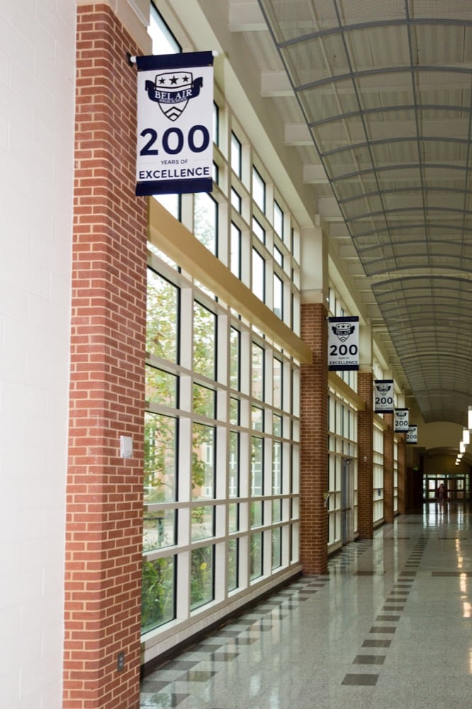
BAHS Hallway
Ideation
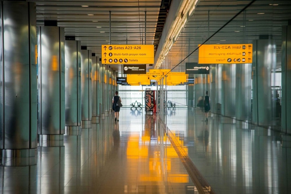
As I was working on getting the above banners up on the walls, I was mulling over some of the other prime display areas in the building, and then I started thinking about the “Freshman Fest” and Back to School Night at the start of next year. I was thinking about the trouble that new students and parents have with navigating the building. I realized that I needed to add some navigation infrastructure to the school like an airport.
As I walked through the building, I started seeing all of these spots on the walls that were easy to see in traffic and at hallway junctures that would be helpful to people navigating the school. But as I thought more about a systematic solution, I realized that the stairwells were the best places to start. I would have a uniform space and a clear understanding of what a person needs at that point in time.
Planning
So first things first, I got a clipboard. Based on everything else on this site you might imagine that I would go first for a tech tool (and you are usually right), but I knew I would need to do a lot of tinkering on the go, so I went old school with a clipboard and a piece of paper.
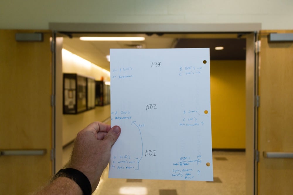
I divided the paper into three rows (my school has 3 floors) and stood at each stairwell with my clipboard. I walked around the floor and looped back to the stairwell. I did this from all four stairwells on all three floors until I came up with a uniform set of requirements:
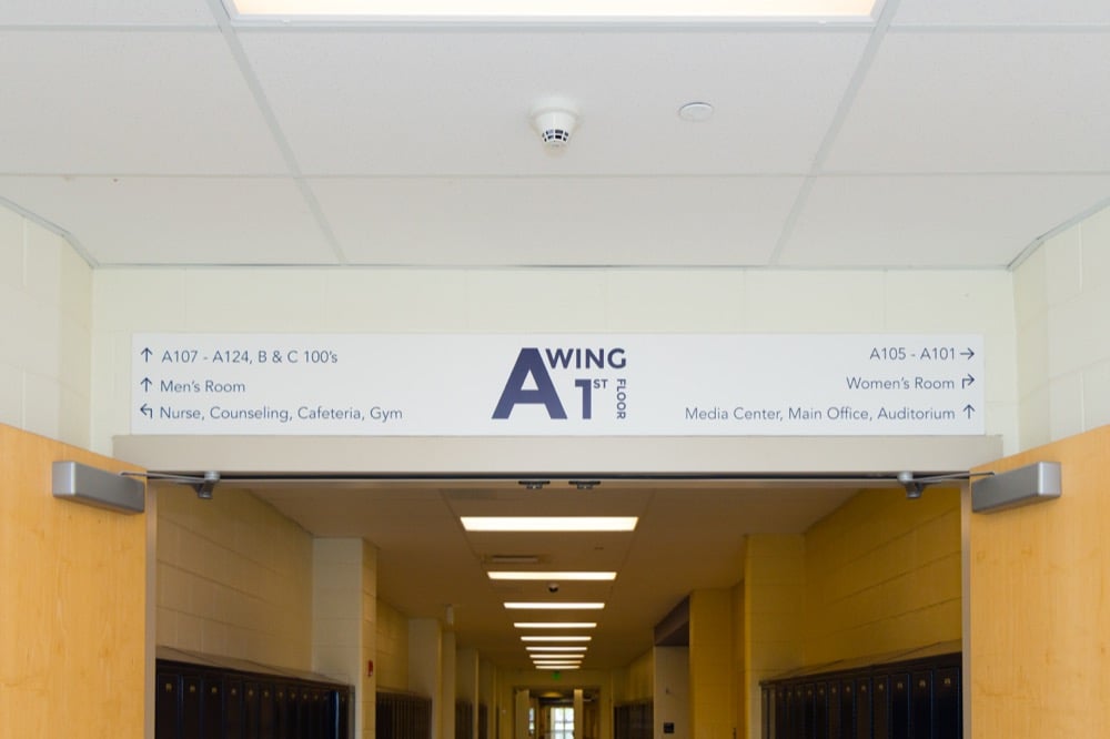
- Every sign would point to room numbers instead of subjects (to be more permanent).
- Every sign would point out the location of restrooms.
- Every sign would also point to long distance targets (like other wings of the building).
- Lastly, the first-floor signs needed to point out the major common areas (i.e., cafeteria, nurse’s office, etc.).
After planning the content for the signs, I met with my favorite local printer to ask about the best product for the job. We settled on 6mm thick PVC, I wanted them to be the width of the doors and tall enough to cover the row of cinderblocks above the door, so we went with 96″ wide and 11.5″ tall signs.
Creating
With an idea and the design specifications, I jumped into Adobe Illustrator. I realized that Illustrator did not like 12 very large artboards in one file, so I split the project up into stairwells. Working off of three artboards I set up guides for all of my margins and got to work. My school’s brand standards meant that I went with Avenir Book for the location information and Montserrat Bold for the title in the center. Everything is our official color of blue (CMYK 73, 59, 0, 86) on a white background. I wanted to make sure the sign was very simple and readable from 20-30 feet away, so I made the font size 127 and made sure that every location fit on a single line and had a healthy amount of space around the text.
As I was working on the design, I got feedback from some administrators in my building and even printed part of the design on computer paper and taped it to the wall above the door to make sure the font size and spacing would work. Once I made sure that all of the alignments were perfect (and had my wife double check the spelling), I nervously pulled the trigger and exported the PDF for the printer. I waited anxiously for them to arrive and was thrilled when they did. They looked and fit exactly like I wanted them to!
Installation
Once they were in the building, I needed to get our facilities department to hang them. I really wanted this design to be clean and uncluttered, so I wanted the sign to be glued to the wall as opposed to screwed. I was worried about the weight of the sign not being held by the glue, but since the sign sits on the ledge of the door, most of the weight does too, so the glue was just fine.
This project started because I had optimized my classroom to free up my time and brainpower to focus on new problems. Then I narrowed down the need for new students, parents, and visitors to navigate the building autonomously. After walking around the building with an open mind, I realized the place to start working was the doors over the stairwells. Once I got to that point, my design constraints and my school’s brand standards made the design easy. It was just down to me not make mistakes. Fortunately, I had the time, energy, and tools to “measure twice and print once.” I also had the benefit of several thoughtful minds to bounce this plan off. In the end, I enjoyed this project and am proud of the new infrastructure I installed around my school. I hope it helps newcomers and visitors for years to come.


Leave a Reply
Want to join the discussion?Feel free to contribute!